


All photos the property of the Bale Family, Copyright 2000-2021
Contact Email Lori Bale...
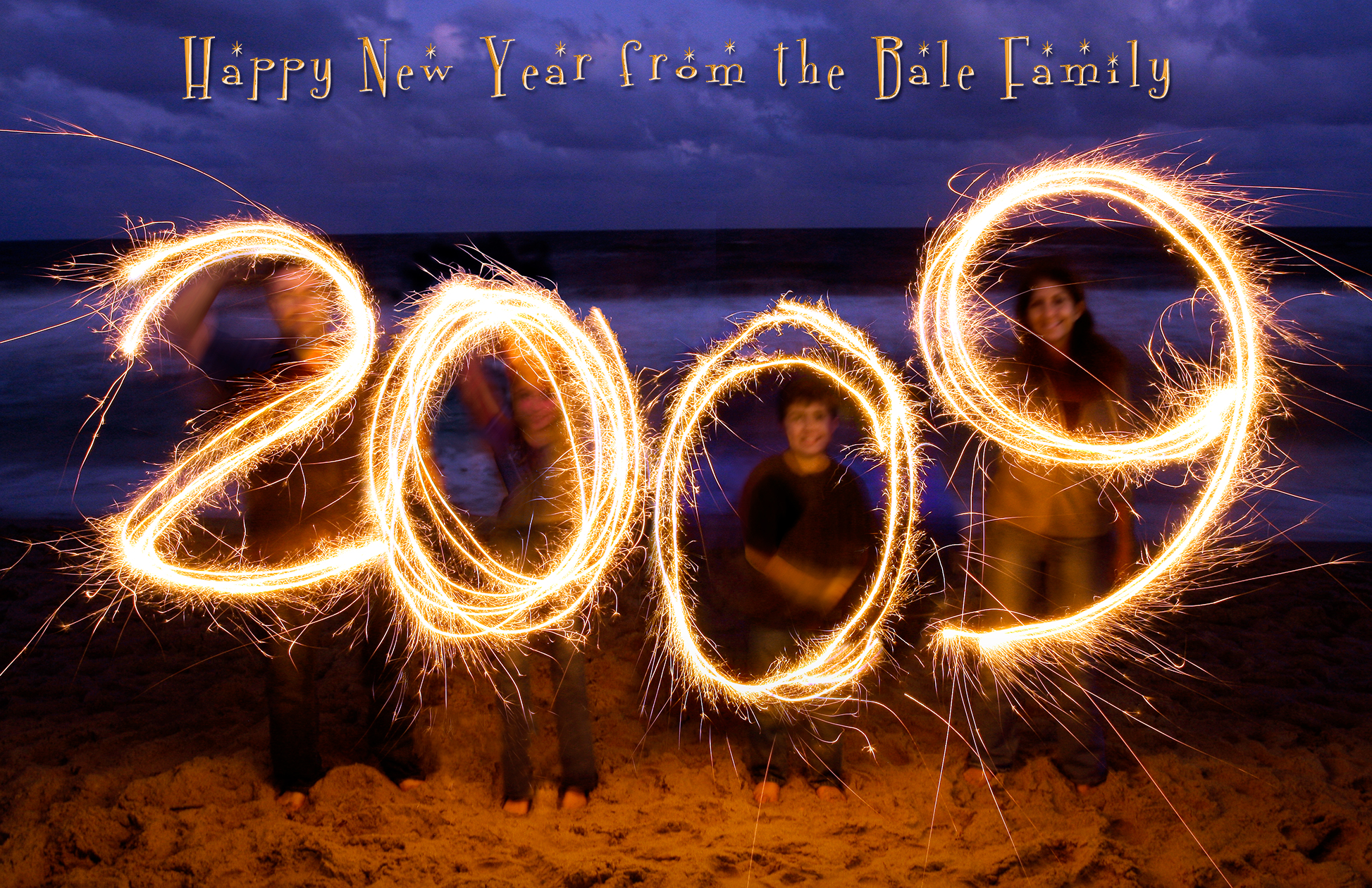
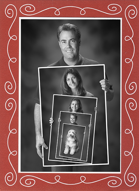
Click photos for larger size.
All photos the property of the Bale Family, Copyright 2000-2021